
Primordia
Only the Worthy will be Chosen
An unlikely heir to a secret bloodline of powerful immortals battles against their ultimate nemesis to restore a stolen power to its destined people.
Edmonton, AB | Horror, Sci-Fi
209 Followers
Mission #3: Poster
See Mission Brief

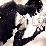
Checkout the posters. Model: Peter Baden, Photographer and Designer: Andrew Guardamano, Make Up by Amandeep Sandhu and Watfee Hajer, Set and Lighting by Navin Patel and Nicholas Slaby, Shoot Supervision by Tanisha Kotowich.


Checkout the posters. Model: Peter Baden, Photographer and Designer: Andrew Guardamano, Make Up by Amandeep Sandhu and Watfee Hajer, Set and Lighting by Navin Patel and Nicholas Slaby, Shoot Supervision by Tanisha Kotowich. So what's in the URN? Well, there are three ways you can find out. First you'll have to kidnap and torture the answer out of me, OR you can read the first and second novels available everywhere, OR you can simply VOTE for Primordia and watch what's lurking inside. It'll be perhaps the most illuminating answer as to how Vampyres are truly created...


Missions

Mission #1 Trailer

Mission #2 Differentiator

Mission #3 Poster

Mission #4 Speechless

Mission #5 Conceptualize

Mission #6 Another Angle

Mission #7 Hype

See Top 15
See Final 5

A Western

The Visitor

Nerd Nite

Fish Eye

Arcade Death Zone

Goons

Pretty. Ugly.

Blood White

Hellmington

Enthralled

Patient 62

Baby Face

Tales From The Castle Of Terror

Cognition

Frackin' Zombies!

The Legend of Davy Crockett

Scales

Human Oil

Lucidity

Across All Galaxies

The Slinger

Playground Rules

People for the Ethical Treatment of Zombies

DJ Duppy - The Reggae Zombie

The Wounded

Theories

Nowhere Fast

Astral Haven

Earthlickers

Generation O

Can Con

The Sad Prince

The Necroslinger

Wasted

Comic Book Wednesday

Chrome Steel

Colt

Melvin and Tyler

Advanced Wizards And Warriors

Wedding Season

Pestis

Postmen

Psychonaut

Edith

Love at First Stab

Hyde and Seek

The Adventures of Porno the Clown

Scum City

Camp Death III: The Final Summer

Hypnotica The Nightmarist

Cupid

Checked In

Sassquatch: Return of the Queen

The Cowboy

Fantome

Collider

Blurry Bits

Sweetblood

High School Brawl

Golden Bros.

Namas-DIE

John Goes To The Olympics

New Ventry

Climax

Henchmen

The Last Canadian

Gauntlet

Black Land

Belushi's Toilet

Seth

Comments (39)
Both are good posters. Liked A better, but I'm in the minority, I guess. Just found out the film has a background in a series of novels. Way to bury the lede.
I picked Poster A with the 39% of the fans.
It was a tough choice both are great. I would of showcased that the movie was based on novels a little more or just bigger.
I think both options of your poster art is fantastic, it draws the eye and is intriguing, and your title font IS distinct and original and doesn't immediately make me think of any other film, which is a tough thing to do these days. I prefer B for it's simplicity and it catches the eye much quicker and dominantly than A does.
The major weakness of both posters is that the title font is indistinct. If a poster does nothing else, it should make the title stand out in the reader's mind. I prefer A because it has a more arresting image.
Would you care to clarify what you mean by "indistinct" and what context do you mean by it?
Great gothic grabber!
both of your posters are really well done! -psychonaut
A is fantastic. B is good, but will speak better to the film-going audience.
Hello I picked Poster A yesterday Primordia. Peter Baden looks great. Great photography by Andrew Guardamano.
Thanks for the pick, Colleen! Glad you liked it and surprised you recognize Peter in all that darkness.
Awesome looking posters. Look big budget and very pro. The flash of gold in the first, and the whisp of smoke in the 2nd both stand out to me. Great job.
Gold and smoke are our bread and butter. Glad those stood out to you!
Report Comment
You are about to report a violation of our Terms of Service. All reports are strictly confidential.
We will NOT remove comments just because you disagree with the statement being made.
Reason for reporting*